 Ah Bartleby! That most enigmatic scrivener who brought us the famous phrase “I prefer not to.” Bartleby is another interesting and strange character from the pen of Herman Melville, who seemed to have a knack for creating them.
As in Moby Dick, the narrator seems to be the most normal of the cast in the book. However, he seems to have a knack for hiring interesting characters to work in his law office. When the short story begins, he already has two copyists, or scriveners, nicknamed Turkey and Nippers and an errand boy and “go-fer” nicknamed Ginger Nut. Turkey appears to be a productive and useful employee in the mornings but grows intractable after the noon hour. On the contrary, Nippers seems to be affected adversely by indigestion, or maybe hangovers, in the morning, making him quite irritable then but becoming increasingly mild and more useful and efficient in the afternoons. The narrator made the best of this:
It was fortunate for me that, owing to its peculiar cause–indigestion–the irritability and consequent nervousness of Nippers, were mainly observable in the morning, while in the afternoon he was comparatively mild. So that Turkey’s paroxysms only coming on about twelve o’clock, I never had to do with their eccentricities at one time. Their fits relieved each other like guards. When Nipper’s was on, Turkey’s was off; and vice versa. This was a good natural arrangement under the circumstances.
 The peccadilloes of his scriveners did not prevent him from prospering. He seems to have had a successful enough practice going that he sees need to bring on Bartleby to handle the ever-increasing workload.
It is entertaining to see how this staff handles the initially useful and industrious Bartleby as gradually more and more things fall under the category of things he would “prefer not to” do. Not only that but it seems the root word of his catch phrase was contagious. The narrator tells us that
Somehow, of late I had got into the way of involuntarily using this word “prefer” upon all sorts of not exactly suitable occasions.

The word pops up in Turkey and Nippers vocabulary as well.
I leave the rest of the tale for your reading pleasure and leave Bartleby the Scrivener for Bartleby the book.
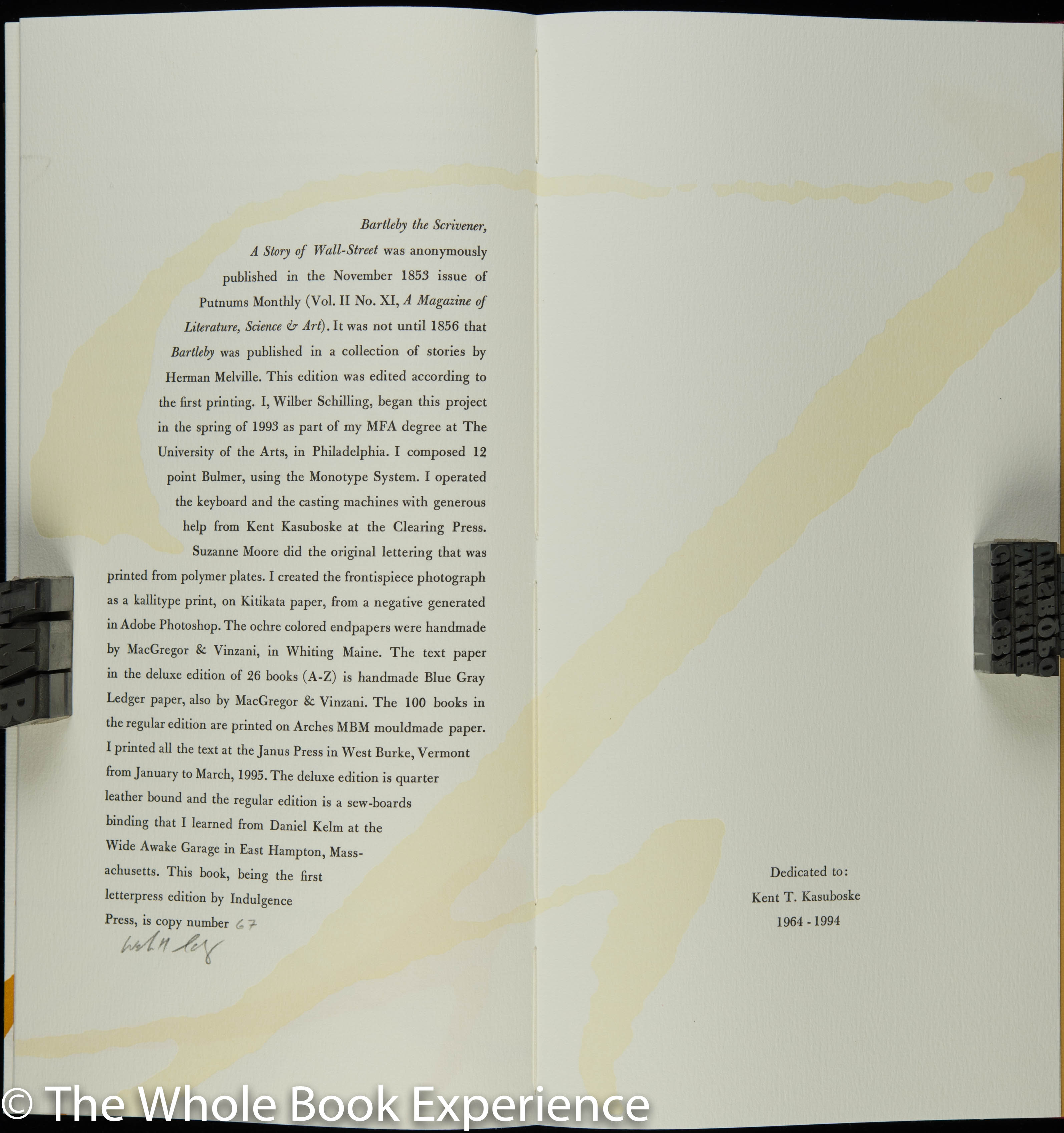
 This edition was begun as part of designer Wilbur Schilling’s MFA and later became the first letterpress book of his Indulgence Press. I don’t know if that means it is also the first book from the press but I’m impressed either way. And super happy that Bartleby has been given the fine press treatment, even if, in his own words, he might tell us “as I said before, I am not particular.”
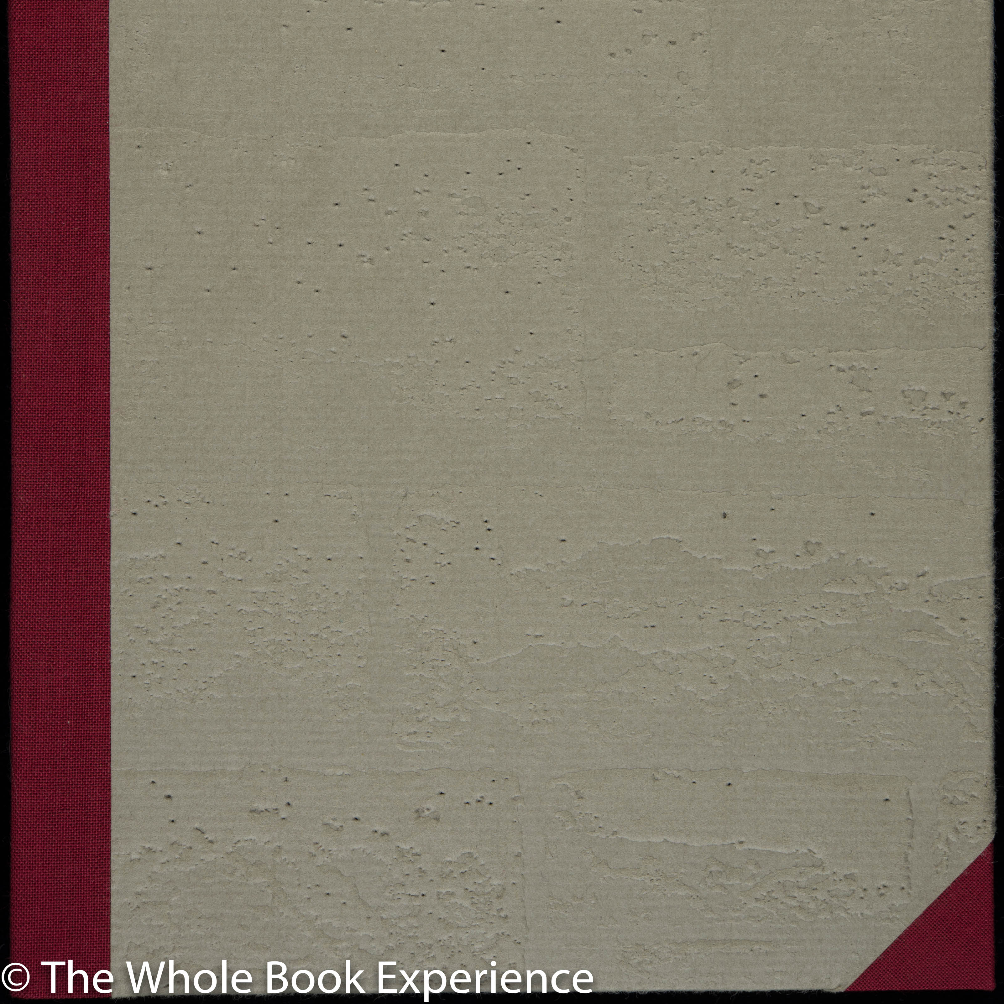
The book is beautiful and well thought out in so many ways that tie the design in with Melville’s tale. The only illustration is the frontispiece photograph: a brick wall with a bricked-in window set in it that could be the exact view Bartleby could see when he stood  at his window in his “dead-wall revery.” The brick wall shows up again in the binding, as an enlarged section of the illustration was used to create a deep etched plate to print the debossed grey paper glued over the boards. The 20pt boards allowing the paper to maintain its debossment and create the tactile feel of brick.
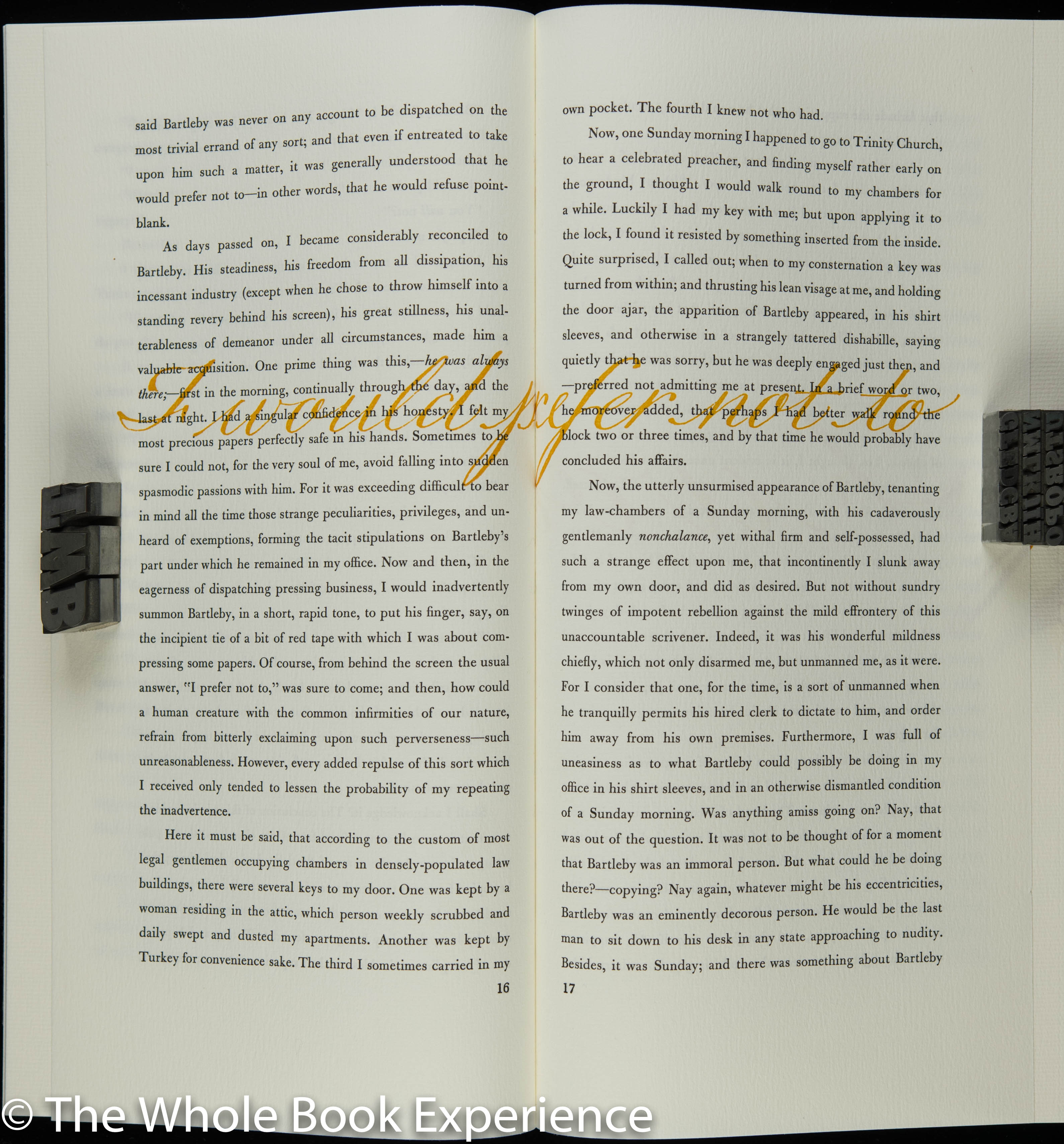
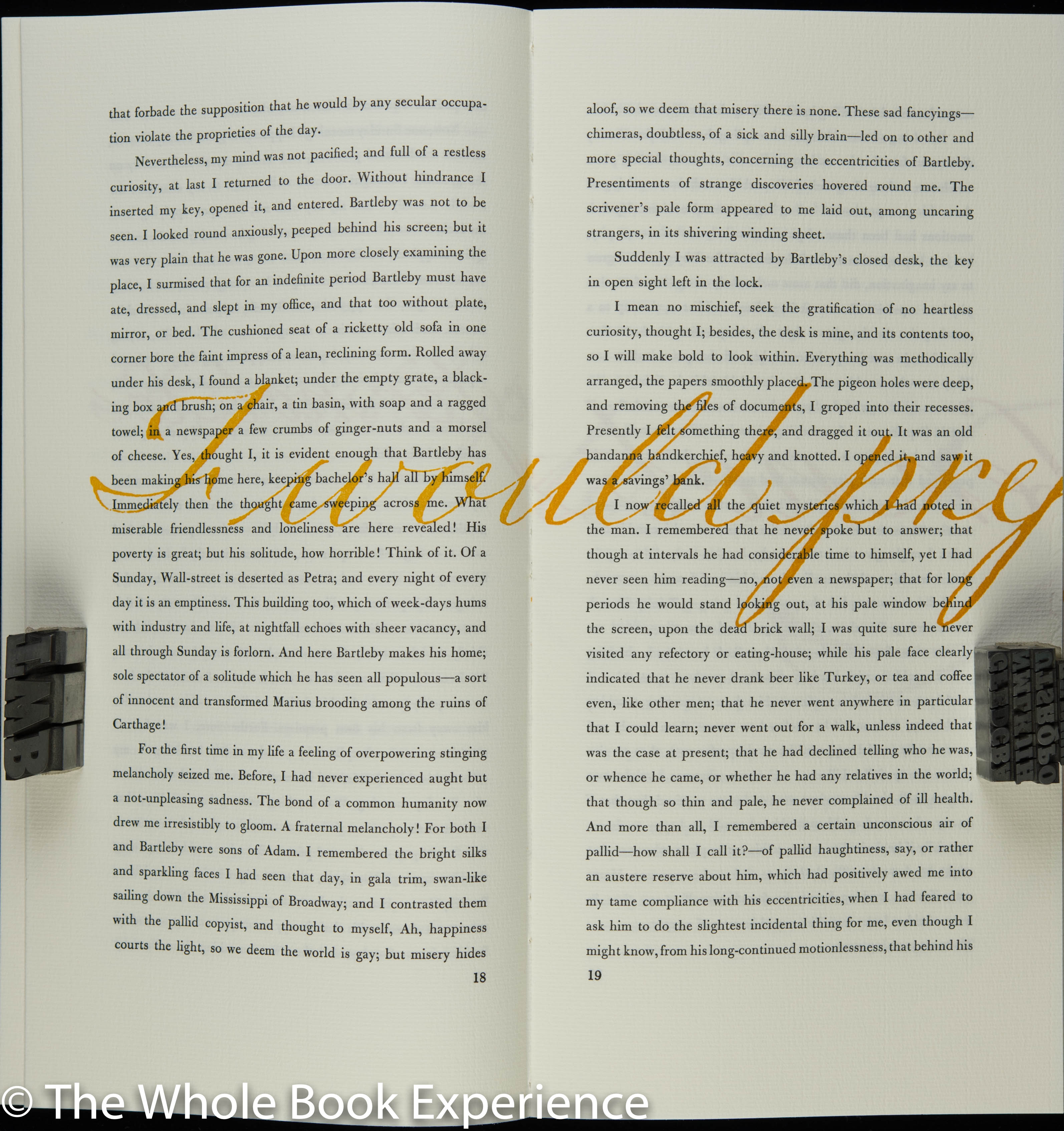
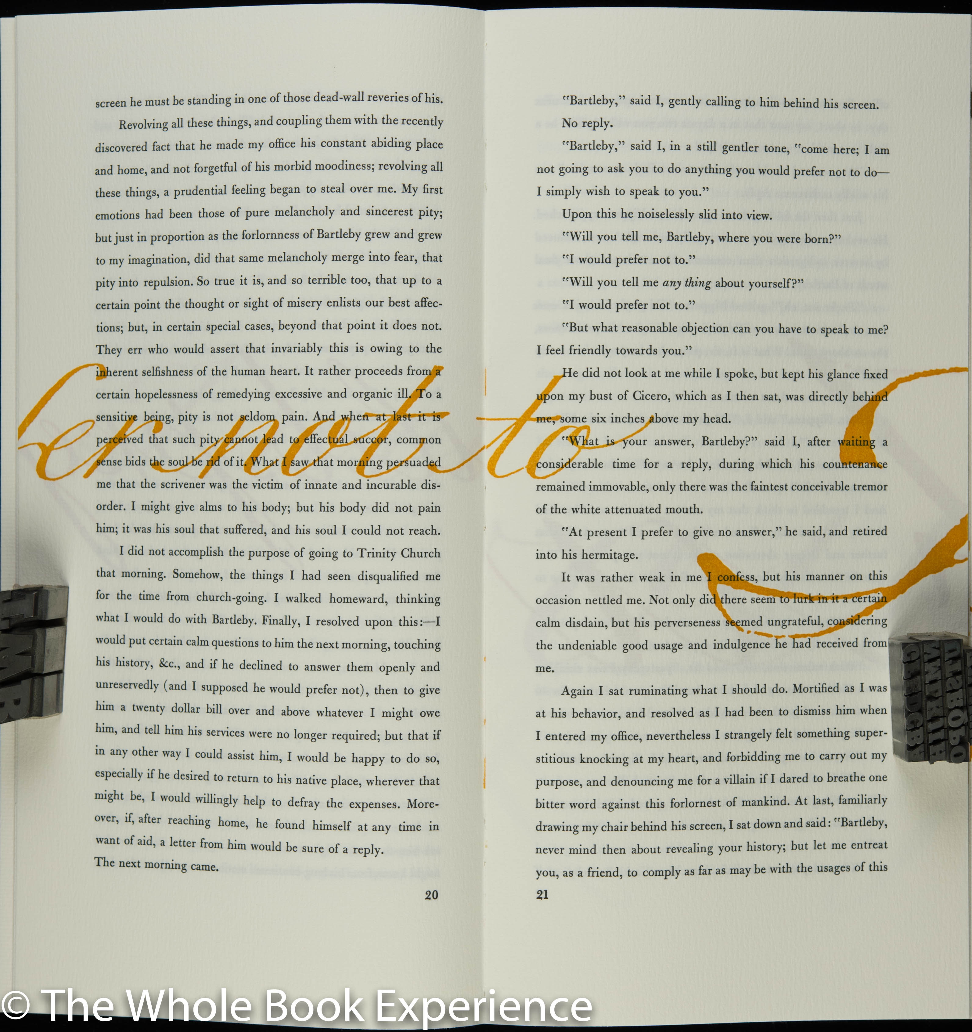
The most striking design feature is the wonderful use of Suzanne Moore’s lettering of Bartleby’s famous phrase. In its first appearance, the lettered phrase takes up the whole verso-recto page spread. On the next page spread it begins again in a bigger size that has to flow to the subsequent pages. And so it continues, with each repetition the size of the lettering increases and the phrase starts in a different place on the page vertically, finally ending on the last page of the text. It begins again for the colophon but by that time it is so big that just a portion of “I” is seen and the colophon itself is tucked into the top of it beneath the ascender serif. Very creative and effective.
 Herman Melville is pretty well represented in the fine and private press world, and not just for his masterpiece Moby Dick. I’ve reviewed beautiful books by or about him a number of times here and am quite pleased to have come across this wonderful manifestation of Bartleby the Scrivener. I would love to see the deluxe edition some day as well but can find no faults with the regular edition.
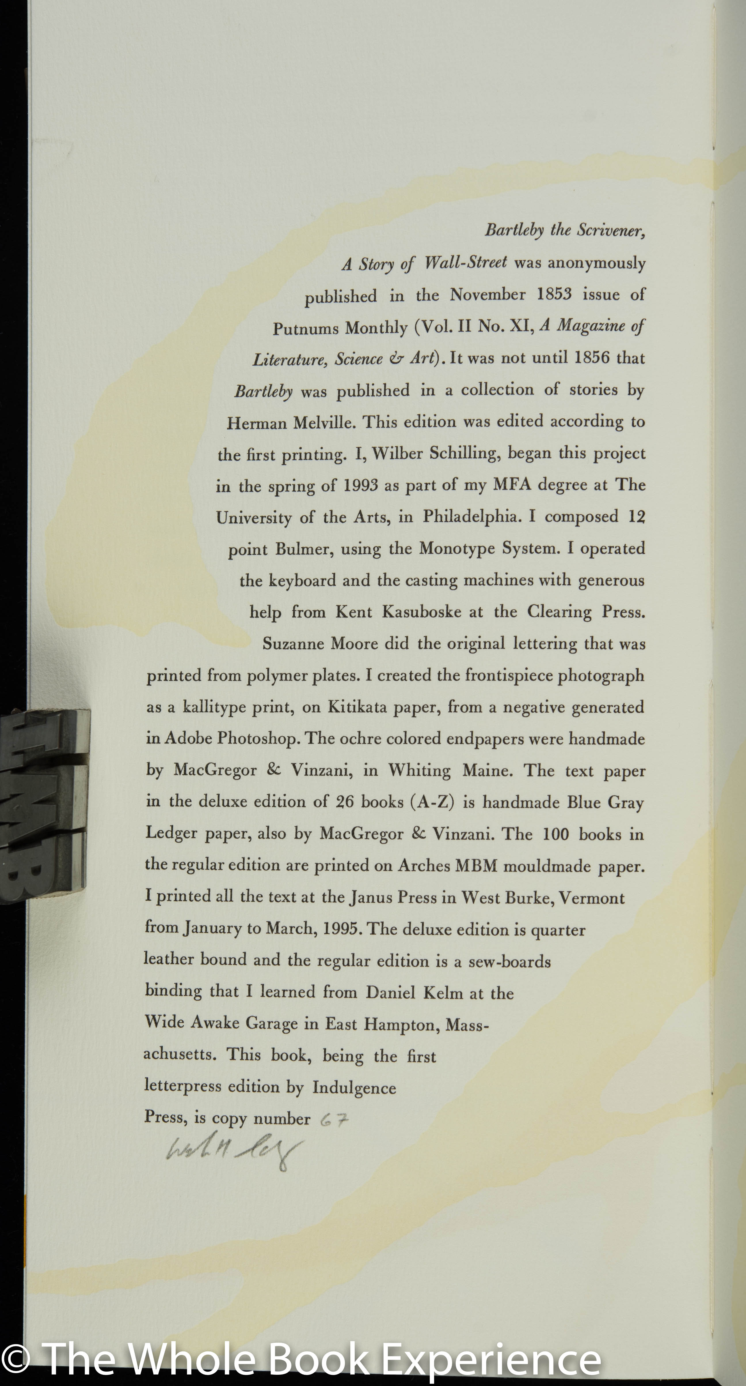 AVAILABILITY: This Indulgence Press book was published in an edition of 100 regular and 26 deluxe copies in 1995. I purchased the last copy of six that Priscilla Juvelis had purchased from the press. Copies may occasionally be found through rare and antiquarian booksellers that carry fine and private press stock.
By several criteria, “Bartleby” is the richest, most entertaining, and most disturbing of Melville’s short stories. The use of a garrulous narrator relating the story of an extremely reticent protagonist is one of many strokes of genius, and the narrative tone is perfectly maintained and we feel we know and understand the narrator perfectly, while, as the narrator states “no materials exist for a full and satisfactory biography” of Bartleby, “one of those beings of who nothing is ascertainable, except from the original sources, and in this case, those are very small.”
Virtually every critical faction from existentialism to Queer theory have claimed the story for their own, but in the end, all attempts to make some kind of “sense” of the story have been unpersuasive (in my opinion). Melville must be laughing ironically from some Olympic height at all these posthumous efforts to understand his work–something his own contemporaries apparently never tried.
I had always wished the LEC had published this work–either as a standalone (preferably) or with the other 5 of “The Piazza Tales” (which would have meant that “Billy Budd” would be a standalone volume–which might also be preferable). This Indulgence Press book fills a long-time desire for a fine press edition and in general seems to be successful in that fulfillment. I like the idea of the binding, and applaud the decision not to illustrate; I generally prefer illustrated editions, but illustrations for this story would be superfluous at best. My one reservation is the use of Bartleby’s phrase as a graphic overlay. I doubt that were I the designer, I would have ever used this device, but I am somewhat of a traditionalist and feel a clean page of well-chosen and well-set letterpress needs no tarting up.