Stately, plump Buck Mulligan…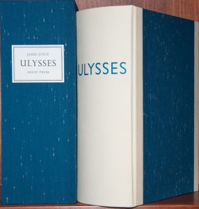 You, Cochrane, what city sent…Ineluctable modality of the visible…Mr. Leopold Bloom ate with relish…By lorries along sir John Rogerson’s…Martin Cunningham, first, poked…Before Nelson’s Pillar….Pineapple rock, lemon platt…Urbane, to comfort them…The superior, the very reverend…Bronze by Gold…I was just passing the time of day…The summer evening had begun…The Mabbot street entrance of nighttown, before which stretches an uncobbled tramsiding set with skeleton tracks, red and green will-o’-the-wisps and danger signals. Preparatory to anything else Mr Bloom brushed off the greater bulk of the shavings and handed Stephen the hat and ashplant and bucked him up generally in orthodox Samaritan fashion, which he very badly needed. What parallel courses did Bloom and Stephen follow returning? Yes because he never did a thing like that before as ask to get his breakfast in bed…yes and his heart was going like mad and yes I said yes I will yes.
So begin (and end) the chapters of Joyce’s Ulysses, his self-proclaimed usylessly unreadable Blue Book of Eccles. Impenetrable modality of the readable, that’s what I might call it. As Joyce himself said, “I’ve put in so many enigmas and puzzles that it will keep the professors busy for centuries arguing over what I meant, and that’s the only way of insuring one’s immortality.” For this reading I combined the Naxos unabridged audio book and the sumptuous Arion Press edition of the book. The audio book clocks in at over 27 hours so it’s still a somewhat daunting task to take on and I’m not sure it’s one I would listen to while driving. I just don’t know if I could focus on the book and the road at the same time. I did, however, listen again to the last chapter (Penelope) and the dream consciousness actually worked well with my long drive up the interstate through California’s Central Valley. With book in hand it was wonderful, though. I definitely picked up lots of things I missed on my first unassisted readings through the novel. Other tools I’ve used in the past to help me through are Gifford’s excellent book Ulysses Annotated and Joseph Campbell’s lectures on Joyce. An enigma and puzzle indeed, but one that I enjoy trying to unravel through multiple readings.
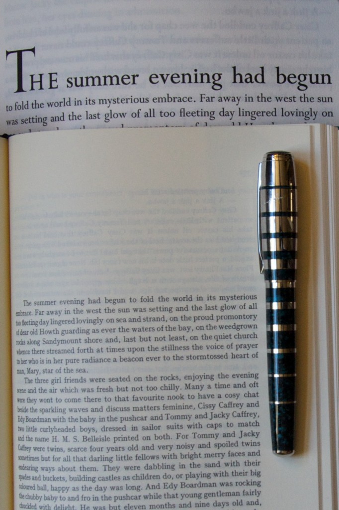
The book I read was one of ten Printer’s copies of the Arion Press edition, meaning that the prints by Robert Motherwell are not bound in. I’ve had the standard edition in my hands in the library at the Arion Press and it is marvelous. But the printer’s copy might be a bit more readable without the heavier paper used for the illustrations trying to turn the pages for you. I believe I’ve also heard that Joyce did not really want Ulysses illustrated, so maybe that is fitting. This is not a book to read without support, weighing in at 12 pounds and measuring 12.75” tall by 9.75” wide and a whopping 5” wide. The size of the type is a joy compared with most editions I’ve read; as long books like this tend to get the small type treatment to save paper and cost at the expense of readability. I really like the way the chapters start with a much larger font and then shrink down line by line to the main type size. The French mouldmade Johannot paper is very tactile. I was constantly running my hands over the pages and pausing occasionally to take in the smell of the paper as I read along.
What a joy of a Joyce book! Now if only one of the presses would tackle Joyce’s “incomprehensible night-book”, Finnegans Wake. This is the only remaining major book of Joyce’s that has not received the fine press treatment.
Availability: This book was published back in 1988. You can see the Arion Press catalogue page for the book here. The edition with the prints sold out long ago and I believe the printer’s edition is also sold out now. Copies do occasionally pop up on the second hand market but not very often. I saw one recently with an extra suite of prints (40 of the edition of 150 were available with this) for a price well into the five figures.
This review is dedicated to the memory of my cousin Andy. He was a fellow reader and an enabler of my love for fine press books. His generosity made this review possible. Rest (and read) in Peace, my friend.

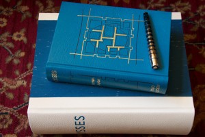
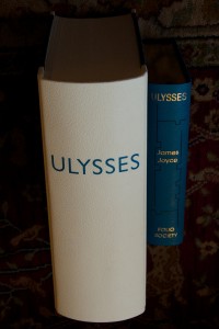
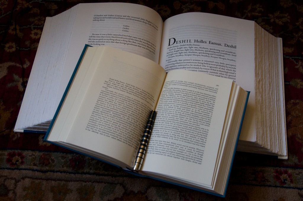
The Arion Press “Ulysses” is a stunner–in more ways the one! I had no idea it was so LARGE. It’s gorgeous, and I’d love to see the printing, but did it really need to be a 12 pound, 5″ thick volume? My 1986 Bodley Head edition of the “Corrected” text, edited by Gabler, Steppe and Melchior, is a mere 9.5″ x 8″ x 1.75″–admittedly with small (but quite readable) type. My Folio Society edition, the standard 1998 edition with Paladino’s illustrations, is 9.5″ x 6.5″ x 2″ with slightly larger, and even more readable type.
Now I love large type, but I think when the type size requires a book as large as the Arion Press volume, I’d prefer that book to be issued in multiple volumes. I understand there are those who don’t like splitting a work over multiple volumes, but I have to say my reading style balks at anything weighing over a few pounds.
I’d like to hear what others think about this issue, which was brought up before in the Folio Society thread on LibraryThing. Are books this large for the shelf only–or do you consider them reader-friendly?
In the words of Sir Mix-a-Lot: “I like big books and I can not lie, You other brothers can’t deny…”. OK, I couldn’t resist that since it’s the first thing that came into my mind after reading your comment. Seriously though, I really love this book above all other editions of Ulysses. This is the edition I grab when I want to READ Ulysses. And I’m one of those that like to read Ulysses, and often. I think the size of the book fits the work; it makes sure I remember that I’m reading Ulysses. It doesn’t let my attention wander away. As you can imagine, some support is necessary. I would obviously grab something more manageable if I was taking the book on a trip or down to café or beach, but that goes without saying since my limited editions rarely venture out of the safety of my house or library. I’ll grab my trade edition if I’m quickly looking for a quote or favorite passage.
I’m not sure why Arion Press made the decision to print this in a single volume. Maybe they just wanted to see if they could? The spine and binding must have taken some careful consideration to make sure that it was sturdy enough to support the text block. Aside from the type size mentioned above, the paper adds considerably to the bulk of the book as well. It could have been slimmed down considerably with a thinner paper but the Johannot paper is exquisite. It is so substantial and the feeling of it is out of the world.
I will say that the Arion Press did decide to split their recent edition of Don Quixote into two volumes, so they are not averse to going that route either. Would I be interested in a multi-volume fine press edition of Ulysses with each chapter bound individually? You bet! Could I afford it? Ummm…
To get a better idea of how this compares with a “normal” sized edition of Joyce, I added a few pictures comparing the Arion Press edition to the Folio Society edition at the bottom of the original post.
No, the pagination is different so it’s a little more work to use the annotated guides but still very useful. It also is 99% compatible with the Naxos unabridged audio book.
I went back and checked the information on the Arion Press website and it does indeed mention a variant binding but I don’t believe that mine is a variant. I seem to remember my Printer’s Copy being the same as the full illustrated edition. What is different is the title page (no reference to Motherwell’s illustrations) and the colophon. Obviously, there no illustrations so there are slightly fewer pages and the paper is uniform throughout. Interestingly, in a discussion of the book with Andrew Hoyem, he mentioned that the printer’s edition was a bit easier to read as the lack of the the thick illustration pages meant you didn’t always have to hold the page your were reading open.