I had the pleasure of visiting CODEX 2011 in Berkeley for a day and thought a report of what I was able to see would be a great way to kick things off at The Whole Book Experience. Here are some thoughts and observations:
- One day is not enough for enjoying the fine press nirvana that is CODEX. I spent one whole day at the Bookfair and only really made it through half the room. My last hour was spent quickly visiting some of the presses that I didn’t want to miss. Next show it’s got to be at least two days at the Bookfair, not to mention possibly making it to some of the talks. My 22 year old daughter Kaelyn picked up the reader/book bug from me and I was honored to have her with me. We were literally like kids in a candy shop.
- One exciting development over the last show was that it seemed there were more international presses represented, especially when it comes to Latin America. I don’t remember seeing any from Latin America at CODEX 2009 but this time I believe there were 4-5, including La Mano Press from Mexico and Libros San Christóbal from Guatemala.
- My Joycean Moment! When we approached the table of Einhand Press I little knew what was in store for us. When we approached the table there were a good selection of beautiful artist books spread on the table, reflections and selections from Gertrude Stein, Edgar Allen Poe, and others I would normally be interested in. But what caught my eye was a “Joyce” tab in a filing box to one side. So after looking at some of the displayed books, I innocently asked whether he had anything on Joyce. Now I’m a Joyce nut. I love the challenge and the constant discovery of reading and re-reading his works and I love to see the different treatments his books have received from presses and publishers over the years. With Reinhold Nasshan of the Einhand Press, I found a fellow Joycean whose enthusiasm and knowledge far outstripped mine. How refreshing. As he showed me book after book that he had done on Joyce, we got more and more excited. I think my daughter thought it was the book-nerdiest moment of the show. We tease each other about Joyce constantly, as I have always been jealous that she was able to take a Joyce undergraduate class at university while I was too busy with my engineering courses. (Just read the Penelope chapter of Ulysses and be done with it, Kaelyn! And you really should let your Dad read your final essay.) Although I’m not necessarily anti-tattoo, I confess I was as close as I could come to being proud when Kaelyn showed them her Joyce inspired “Non Serviam” tattoo on her foot. Anyway, one of Reinhold’s Joyce artist books is definitely on my wishlist.
- I had a wonderful discussion with Alain Gorius(?) of Al Manar. They are located in France and specialize in Poésie, peinture, & littérature of France and the French Mediterranean.
- There’s a new California Press in the house! I’m always amazed at all of the presses out there to discover that are doing amazing work, and even more amazed when one pops up in my own state. I chatted with New Albion Press proprietor Jonathan Finegold about his first book, a sumptuous edition of Shakespeare’s Sonnets. The edition commemorates the 400th anniversary of the 1609 first printing of the sonnets and the 100th anniversary of the 1909 Dove’s Press edition. Jonathan used a recreated type based on the original Dove’s type that was tossed in the Thames when the press closed down. Both states of the book were on display and were gorgeous. Jonathan also had a broadside of Walt Whitman available and that led us to discuss whether it was time for a new fine press edition of Leaves of Grass. I think….YES! To my knowledge, there is the famous Grabhorn edition of 1930, then two editions (1929 and 1942) by The Limited Editions Club, the Heritage/Nonesuch Press edition of 1936, the 1945 Peter Pauper Press edition, but nothing more recent (I’m not counting facsimiles).
- It’s a great thing for a fine press lover when someone does an edition of one of your favorite authors, especially when it’s one that one would not be holding out much hope to see in a fine press book. But that’s exactly what happened when I found out that Foolscap Press had done Ursula Le Guin’s Direction of the Road. Unfortunately, “had” is the keyword as the edition is out-of-print. I did get to look at their presentation copy. The linen paper rustles as you turn the pages bringing you closer to the oak tree that is the narrator of the story. Nice!
- I was really impressed with Sherwin Beach Press‘ book The Essence of Beeing. In speaking with Robert McCamant of the press, I learned that he had a supply of the Fabriano Roma Michelangelo paper from many years ago and in using it for this edition was able to meet a price point that would be impossible if he had to buy the paper today. This is one of the books on my short list to pick up as my “CODEX 2011 Book”. Also of note was an edition of Twain’s Innocents Abroad. This had a very cool non-adhesive binding with exposed spine that I’ve never seen before. As illustrations, they used graphic novel type pages by Heather McAdams.
- We had a nice chat with Derek Pyle of the Jubilation Press. My daughter ended up purchasing a broadside of Derek’s great poem Dumpster Meditation.
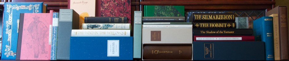
- As usual, it was great to catch up with Jan and Crispin Elsted of the Barbarian Press. [Full Disclosure: I am lucky enough to be a subscriber to this press]. They are wonderful people and I love their enthusiasm about the books they produce. They had the first copy of the long-anticipated Pericles on their table and it looks fabulous. I’ll post more on the book later when I actually have a copy in my hands. It’s been so long since I first worked through the entire Shakespeare canon as a teen that I don’t remember much about this play but I’m looking forward to re-reading it and the companion volume of commentary that is included in the edition. Being a subscriber to a fine press has helped to teach me about patience; this book has been 12(?)ish years in the making and although I haven’t personally had it in my sights for that long one does need to slow down one’s expectations to the speed of hand made books. Quite a challenge in this era of instant consumer gratification.
Great reviews, and thanks for the links!
A few personal observations:
The New Albion Press edition of the Shakespeare Sonnets brings up an interesting aspect of typographic design: should the type layout be intended purely as a design element on the page, or primarily for best facilitating readability. The page reproduced on their website is gorgeous, but I personally find breaking the lines the way they did distracting. I think back on the LEC’s Complete Shakespeare, and how the size of the volumes and the type layout reflected Bruce Rogers’ belief that the lines should not run over, but that each line should be unbroken.
In that regard, my other observation is about the Barbarian Press edition of Pericles: the press seems to have followed Rogers’ practice–at least in the pages displayed on the site I see no line breaks. The illustrations seem superb, and I’d like to see a copy in person to see the quality of the reproduction. I’m less enamored of the portraits they’ve reproduced, as they seem a little characterless, but the scene setting illustrations, especially the one on the first page, are wonderfully integrated with the text. I will have to reread this play, as I am still unconvinced from my memory of reading it in college that it was worthy of this lavish presentation. How I wish the Folio Society’s Letterpress Shakespeare had taken this approach (regarding the inclusion of illustrations).
From what I recall from seeing the book at CODEX, I believe that the New Albion Press Sonnets only uses the decorative initial capital letter (as shown on the website) on a couple of the pages. The bulk of the sonnets are printed in more standard form of 14 unbroken lines, two to a page. The sonnets are numbered in the margins with different colors reflecting their location in the Sonnets’ sequence.